Flexibles (Responsive Tables)
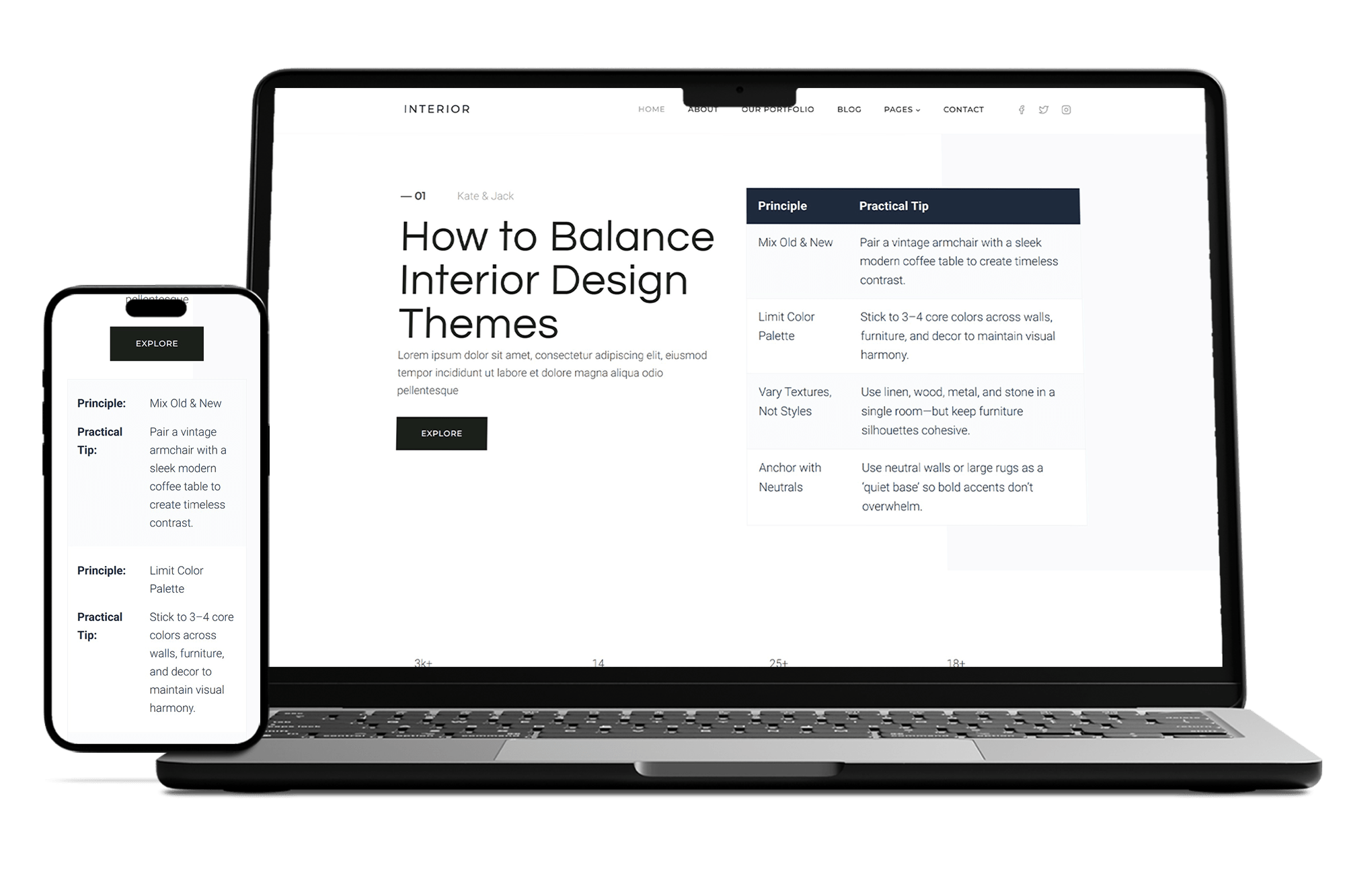
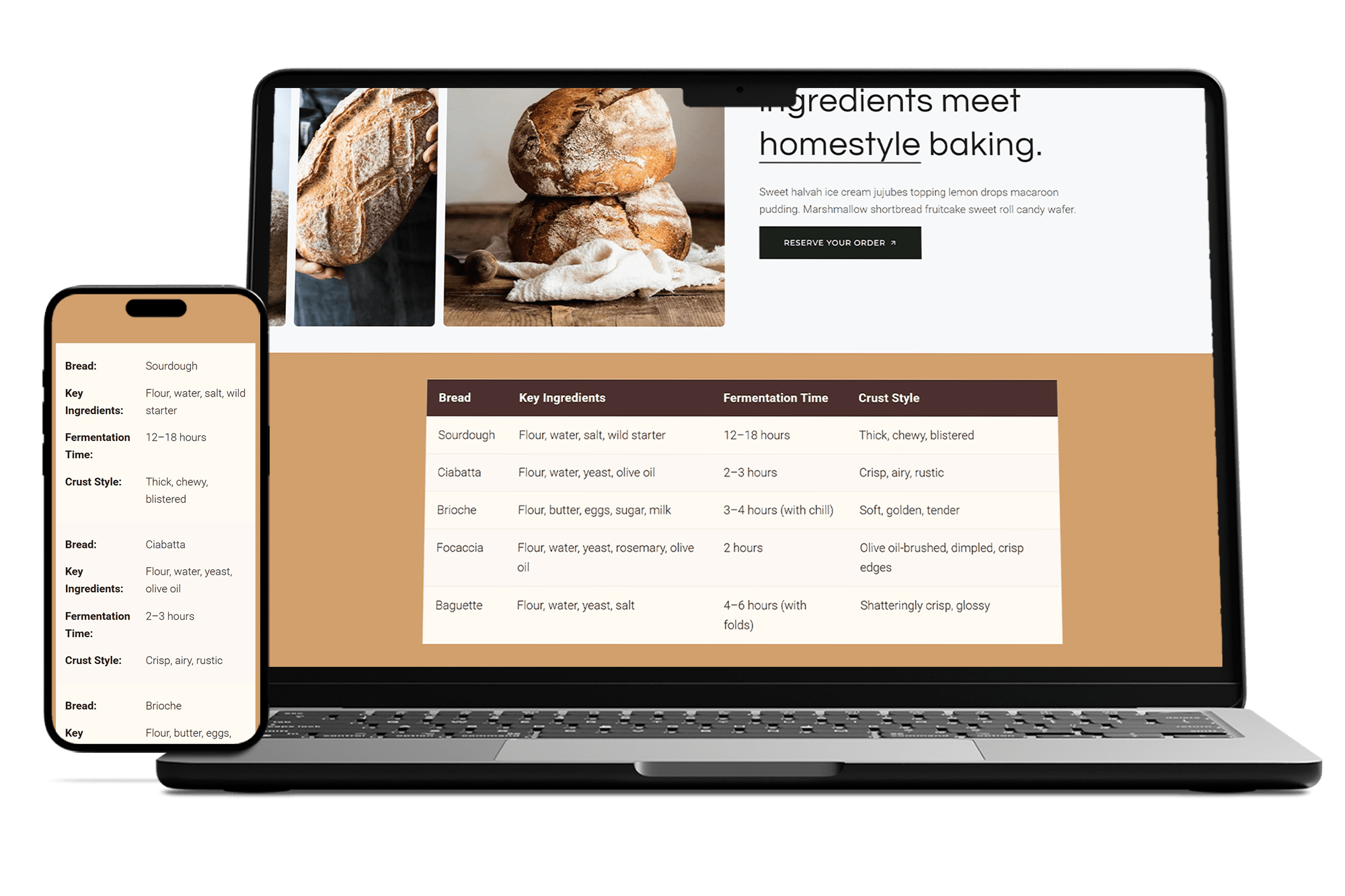
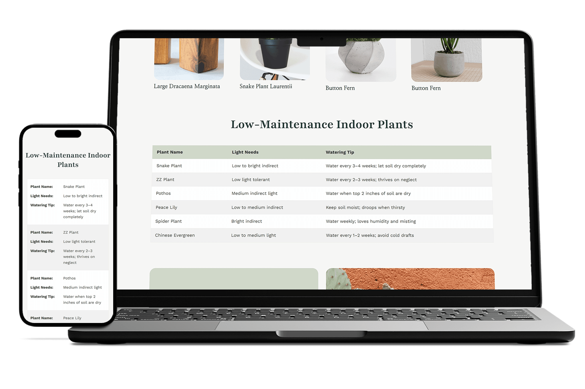
Responsive Tables That Adapt to Any Device
Transform your WordPress tables into mobile-friendly masterpieces with flexible layouts, custom styling, and seamless responsiveness. No coding skills needed, just professional, accessible results that look great on desktop, tablet, and mobile.
Key Features of Flexibles
Fully Responsive Design
Tables automatically adapt to any screen size, ensuring perfect display on desktop, tablet, and mobile.
Mobile Stacking Mode
Transforms tables into card-like layouts on small devices for better readability without coding.
Customizable Styling
Easily adjust colors, borders, fonts, and spacing to match your site’s theme.
Accessibility Compliant
Built with WCAG standards for screen readers and keyboard navigation.
No Coding Required
Simple shortcode and visual editor make creating tables quick and user-friendly.
Lightweight & Fast
Minimal code footprint for optimal performance and quick loading times.
Frequently Asked Questions
Everything you need to know about Flexibles (Responsive Tables)
Flexibles is a lightweight WordPress plugin that lets you create and display responsive tables without coding. It includes an admin builder for easy table creation, shortcode embedding, and automatic responsiveness for mobile devices.
Purchase and download the plugin from your purchase site (e.g., yellowlamp.shop). You will then receive a “Purchase Receipt” email containing the plugin download links. On your website, go to Plugins > Add New > Upload Plugin, select the ZIP file, and click Install Now. Activate it. Ensure your site meets requirements: WordPress 5.0+ and PHP 7.4+. If activation fails, check for compatibility errors in the admin notices.
Log in to your WordPress admin, navigate to Flexibles > Tables, and click Add New Table. Use the visual builder to add rows/columns, edit cells (supports HTML), and set settings like responsiveness. Save the table and note its ID for shortcode use: [yl_wprt_table id="1"].
The plugin handles responsiveness automatically. On mobile, columns stack or hide based on settings. You can customize via shortcode attributes like responsive="false" to disable, or hide_columns="2,4" to hide specific columns. Test on different devices using the admin preview.
Yes, use the admin settings for global styles, or add custom CSS classes via shortcode (e.g., class="my-table"). Override with theme CSS targeting selectors like .yl-wprt-table th. For advanced changes, use filters like yl_wprt_table_output or dequeue plugin styles and enqueue your own.
The plugin checks for minimum requirements (PHP 7.4+ and WordPress 5.0+) on activation. If your environment doesn’t meet these, it deactivates itself and shows an admin notice to prevent errors. Update your PHP/WordPress version and try activating again. If issues persist, check for hosting restrictions or contact support.
This is a premium plugin with full features like styling options, export/import, and priority support. Purchase a license from yellowlamp.shop and activate it in the plugin settings for access to all functionality.